25 High-Converting Landing Page Examples (and Why Each Works)
Practical reading with ideas you can apply to product pages, landing pages, and funnels.
Updated
What makes a landing page high-converting?
A high-converting landing page makes one clear promise and asks for one action. The 25 pages below share five traits: a headline about the visitor's outcome, one main action with few fields, the offer's terms beside the button, specific proof near that button, and an easy way to start.
- An outcome headline. It says what the visitor gets, not what the product is called.
- One main action. The same button or form appears wherever the visitor looks, and it asks for one or two things at most.
- Terms beside the button. Price, trial length and "no credit card" sit in the line under the call to action, where the doubt arises.
- Specific proof near the action. Counts, ratings and named customers, not generic praise.
- A low-effort start. Single sign-on, a pre-filled calculator, or a softer second option for visitors who are not ready to commit.
Key Takeaways
- The pages that stood out did not have unusual designs. They removed effort: fewer fields, one-click sign-up and pre-filled estimates.
- At least 15 of the 25 pages put a price, a trial length or "no credit card" within a line of the main button.
- Proof works best when it is specific and close to the action. "Trusted by over 306,000 customers" under HubSpot's button is more specific, and closer to the decision, than a logo strip at the bottom of the page.
- Above-the-fold content still gets the most attention. In NN/g's eyetracking study, 57% of page-viewing time went to the first screenful.
- We can't see these pages' conversion rates, and none of the companies publish them. Treat each example as a pattern to test on your own page, not a guaranteed result.
Jump to: the 25 examples · summary table · how long should a landing page be? · what goes above the fold? · how to use these examples · how we chose.
Most landing page galleries show a screenshot and say the page "looks clean". That doesn't tell you what to change on your own page. Each example below is a real page we captured on 2 November 2026, with three numbered callouts on the screenshot and a note on why each one matters for conversion. Where a page has a weakness worth testing, we say so. If you want a checklist to run against your own page afterwards, use the landing page audit checklist.
The 25 examples
The examples are grouped by the technique they show best, so you can jump to the problem you have. Every screenshot is the first screen of the page on a 1440 × 900 desktop window, with cookie banners and most pop-ups hidden. The numbers on each screenshot match the numbered points under it.
Show visitors their own result
These pages answer "what's in it for me?" with a number about the visitor, not a claim about the product.
1. Airbnb Host: an earnings estimate as the headline
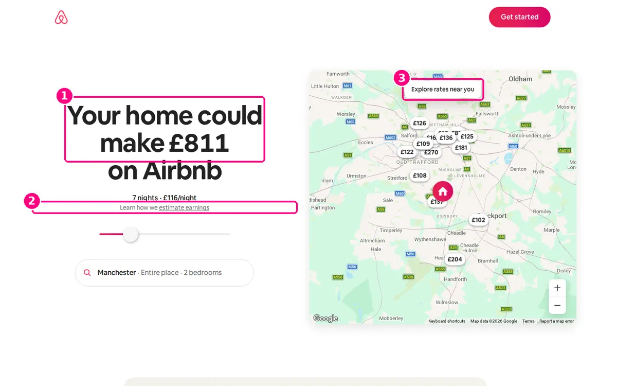
Screenshot: Airbnb, "Host your home on Airbnb", captured 2 November 2026 from the UK.
- The headline is a personal estimate. "Your home could make £811 on Airbnb" is calculated for a location and home type the page has already filled in (Manchester, entire place, two bedrooms). The visitor reads a number before reading any pitch.
- The estimate is adjustable and explained. A slider changes the number of nights, and a "Learn how we estimate earnings" link sits under the figure for visitors who doubt it.
- The map supplies the proof. Nearby listings with their nightly prices back up the estimate without a single testimonial.
Copy this: if your product saves or earns money, put a calculator with sensible defaults where your headline would be.
2. Wise: the quote is the hero
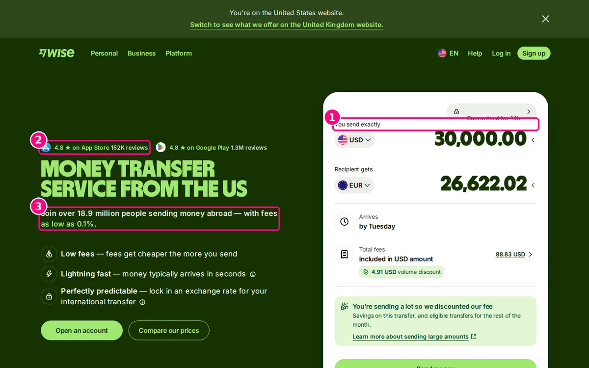
Screenshot: Wise, "Send money", captured 2 November 2026.
- The calculator answers the buying question. A visitor sees exactly what the recipient gets, the total fee, when the money arrives and how long the rate is guaranteed. That is the whole decision, made above the fold.
- Ratings sit above the headline. "4.8 on App Store, 152K reviews" and "4.8 on Google Play, 1.3M reviews" are the first thing above the headline, with the review counts to back them.
- The proof is specific. "Join over 18.9 million people sending money abroad, with fees as low as 0.1%" gives a number for popularity and a number for price.
Copy this: if visitors come to compare prices, show them their price straight away instead of a "Get a quote" button.
3. Semrush: the form field is the product demo
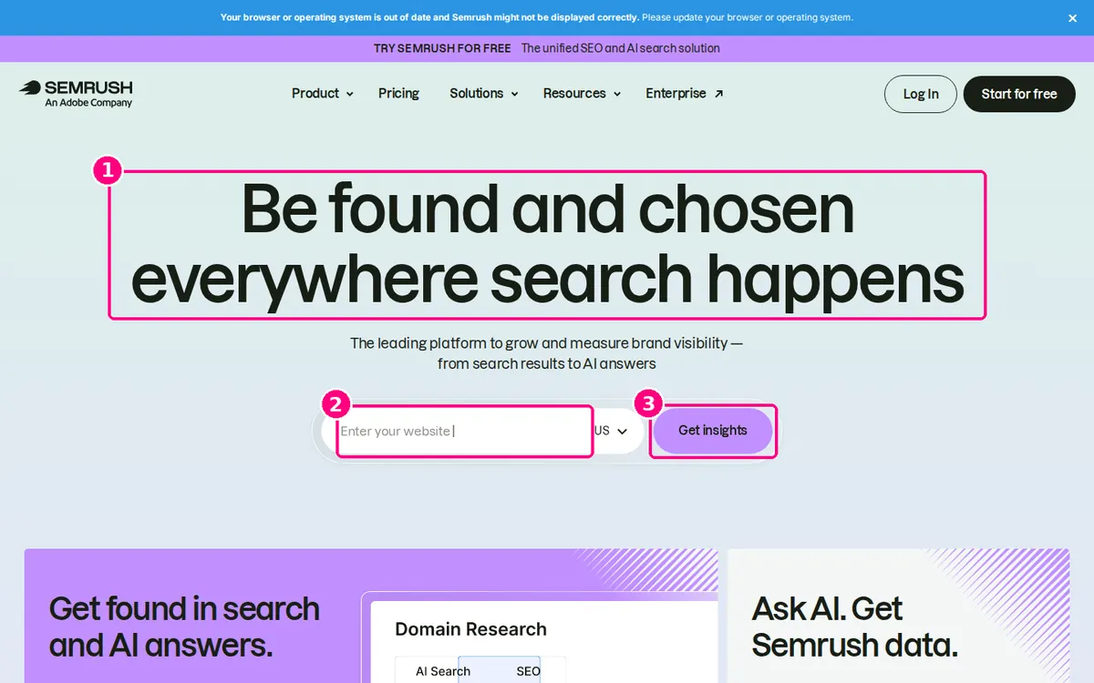
Screenshot: Semrush homepage, captured 2 November 2026.
- A broad headline. "Be found and chosen everywhere search happens" covers search engines and AI answers in one line.
- The first field asks for something the visitor knows. "Enter your website" asks for something the visitor knows by heart and wants to learn about. Nobody hesitates to type their own domain.
- The button names the reward. "Get insights" says what happens next, not "Submit" or "Sign up".
Worth testing: the headline describes Semrush's ambition more than the visitor's problem. A version naming a specific outcome (more traffic, more AI mentions) could be tested against it.
Ask for one thing
These pages keep the first commitment small: an email or a phone number, and nothing else.
4. Netflix: one field, price and cancellation in one line
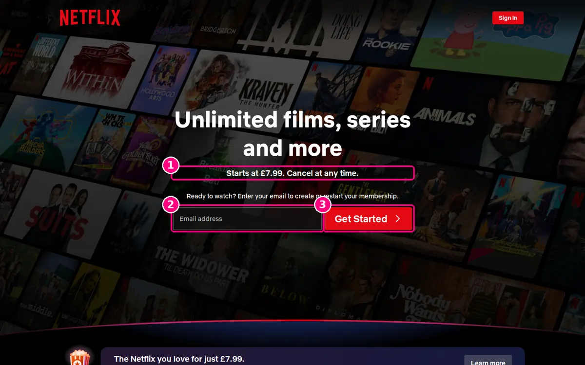
Screenshot: Netflix homepage, captured 2 November 2026 from the UK.
- The terms come before the form. "Starts at £7.99. Cancel at any time." answers the two objections a visitor has, price and lock-in, before they reach the button.
- One field. Only an email address is needed to start, and the line above it ("Enter your email to create or restart your membership") also serves returning members.
- A button that stands out. The red "Get Started" button is the strongest colour against the dark background.
Copy this: write your terms as a short line next to the button, in the visitor's words: price, and how to leave.
5. Shopify free trial: an offer, then a single email field
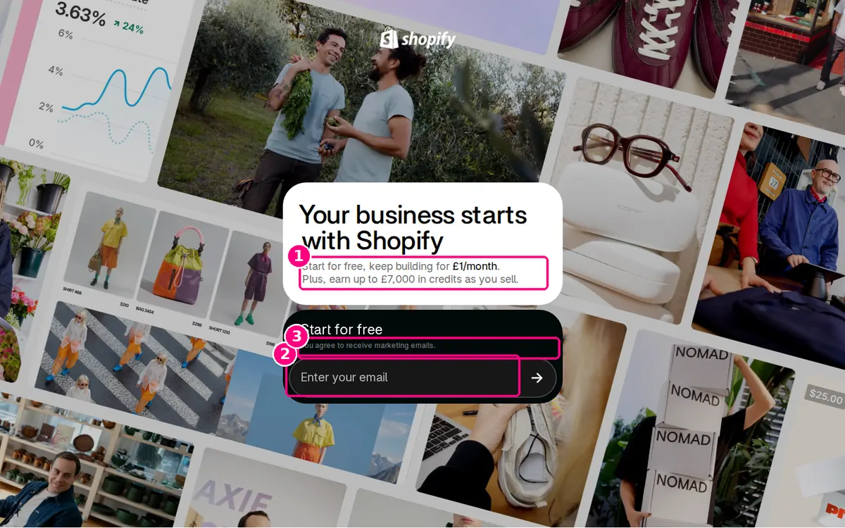
Screenshot: Shopify free trial, captured 2 November 2026 from the UK.
- The offer is in the subhead. "Start for free, keep building for £1/month" tells the visitor what happens after the free period, which is the question most trial pages leave unanswered. "Plus, earn up to £7,000 in credits as you sell" adds value that grows with the visitor's sales.
- One field, inside the card. The email field and arrow button are the only interactive elements in the hero card.
- The consent line is in plain sight. "You agree to receive marketing emails." sits directly above the email field, so nobody agrees to it unseen.
Worth testing: bundling marketing consent into sign-up may put off some visitors. An optional opt-in would show whether it costs sign-ups.
Copy this: say what the first paid step costs, next to the free trial offer.
6. Trello: an inline sign-up form with the privacy note attached
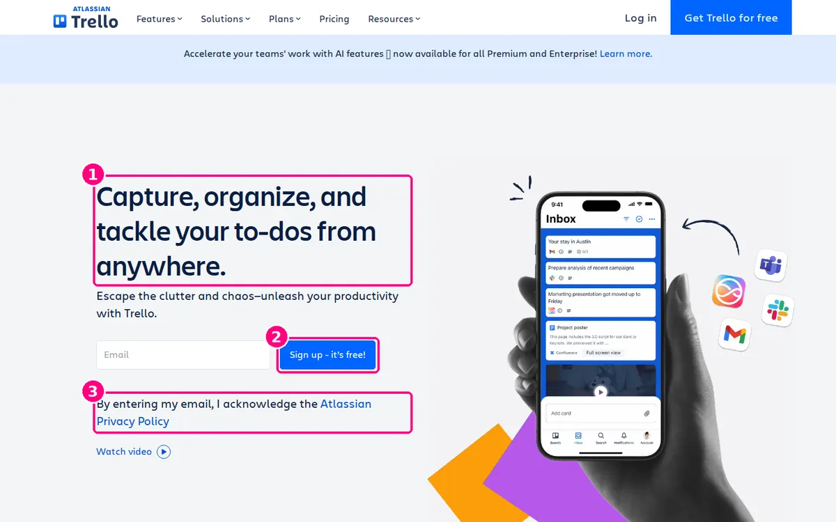
Screenshot: Trello homepage, captured 2 November 2026.
- A headline built from verbs. "Capture, organize, and tackle your to-dos from anywhere" describes what the visitor will do, in the order they'll do it.
- The price is on the button. "Sign up - it's free!" puts the cost on the button itself, next to a single email field.
- The privacy note is under the field. "By entering my email, I acknowledge the Atlassian Privacy Policy" answers the data question at the moment it comes up.
Copy this: put your price ("free", "£9/month") in the button text when it's low enough to be a selling point.
7. Intercom: review count, work email, trial terms
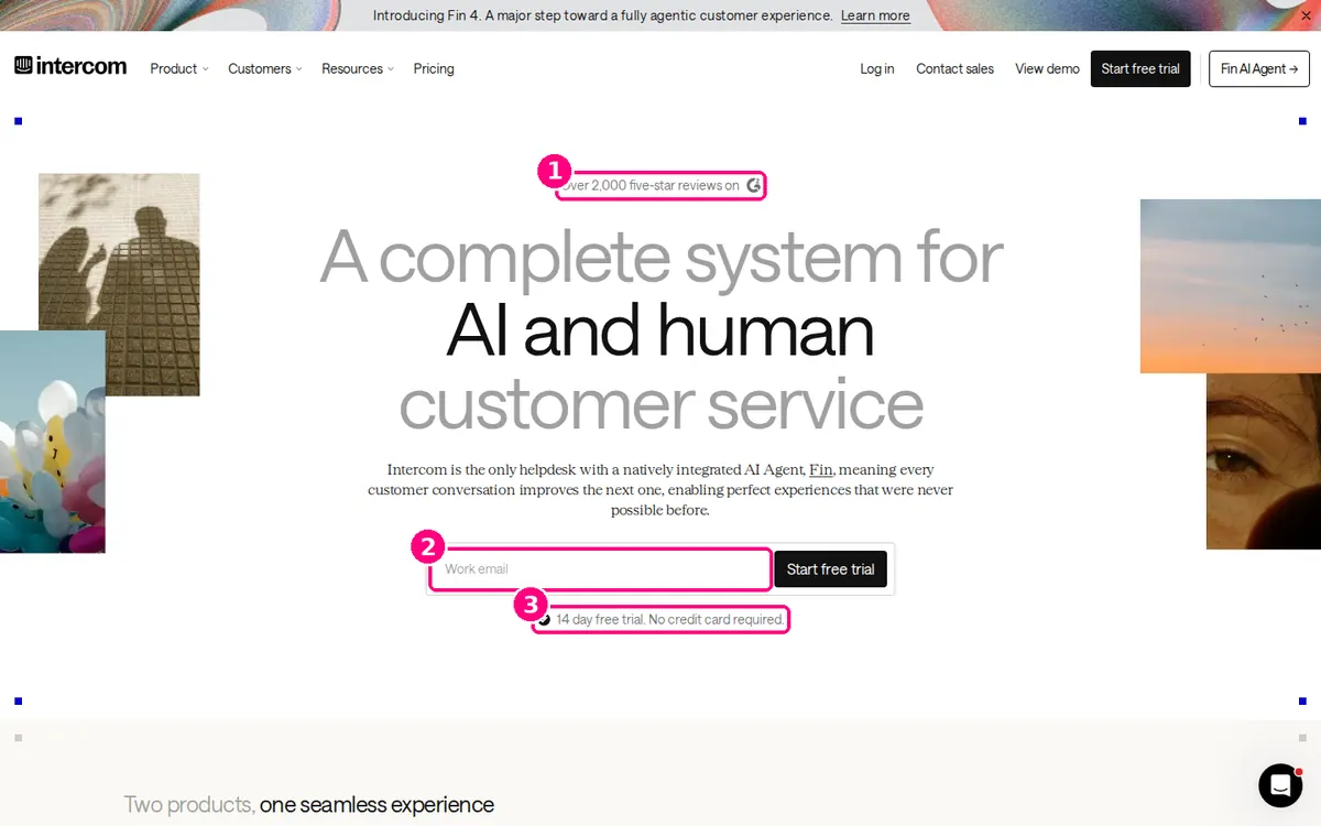
Screenshot: Intercom homepage, captured 2 November 2026.
- Proof above the headline. "Over 2,000 five-star reviews on G2" sits above the headline, so it's read before the pitch.
- A work email field. Asking for a work email suits a B2B product that needs to reach a team, and it is still one field.
- Trial terms under the button. "14 day free trial. No credit card required." removes the two biggest reasons to put off a trial.
Worth testing: the headline ("A complete system for AI and human customer service") is about the product. A version stating the support-team outcome could be tested.
8. Lyft Driver: a phone number and one button
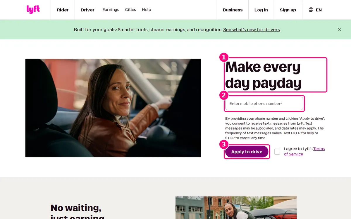
Screenshot: Lyft, "Become a Lyft driver", captured 2 November 2026.
- A four-word headline. "Make every day payday" speaks to the main reason people drive: fast access to earnings.
- One field the visitor has to hand. A mobile number is quick to type on a phone, and the consent text says Lyft will use it to send text messages.
- The button names the action. "Apply to drive" is clear about what the visitor is starting.
Copy this: match the first field to the channel you'll use to follow up.
9. DoorDash Dasher: a full form, framed by the visitor's goals
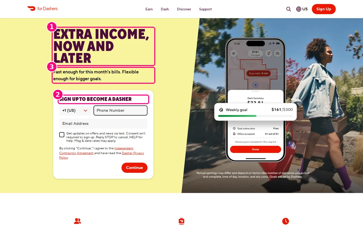
Screenshot: DoorDash, "Sign up to deliver", captured 2 November 2026.
- A headline about the visitor's money. "Extra income, now and later" covers two motivations in five words.
- The form is in the hero. Phone number, email and one button sit in the first screen. The text-message checkbox is optional and says so ("Consent isn't required to sign up").
- The subhead handles two kinds of visitor. "Fast enough for this month's bills. Flexible enough for bigger goals." speaks to urgent and long-term earners at once.
Copy this: say clearly which boxes are optional. NN/g's form guidance is to label optional fields clearly, so nobody fills in more than they need to.
State the offer and its terms
These pages make the deal concrete: what it costs, for how long, and what happens next.
10. Kit: a dated offer and a three-part guarantee line
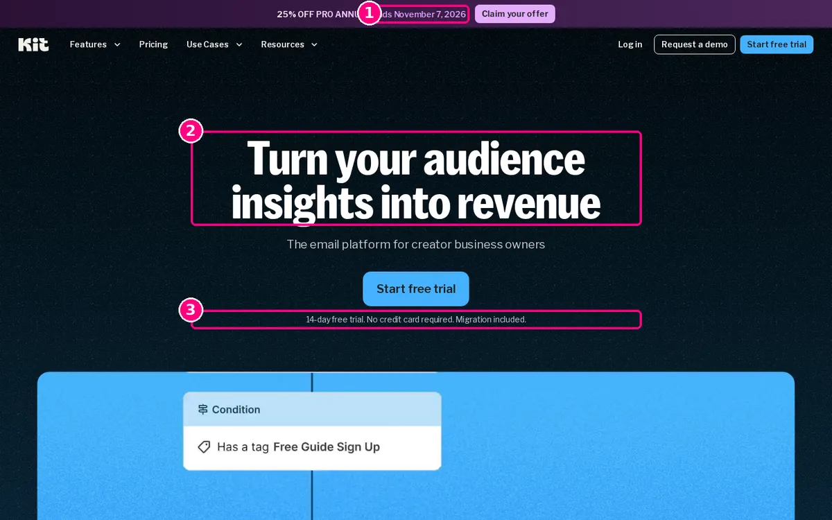
Screenshot: Kit homepage, captured 2 November 2026.
- The deadline is real and dated. "25% off Pro annual. Ends November 7, 2026" gives a reason to act this week, with a date rather than a countdown timer.
- A headline for a defined audience. "Turn your audience insights into revenue", with "The email platform for creator business owners" underneath, tells non-creators this isn't for them, which is useful filtering.
- Three objections handled in one line. "14-day free trial. No credit card required. Migration included." covers trial length, payment risk and the effort of switching.
Copy this: if switching from a competitor is the real barrier, say what you'll do about it under the button.
11. FreshBooks: the discount and the onboarding help, stated twice
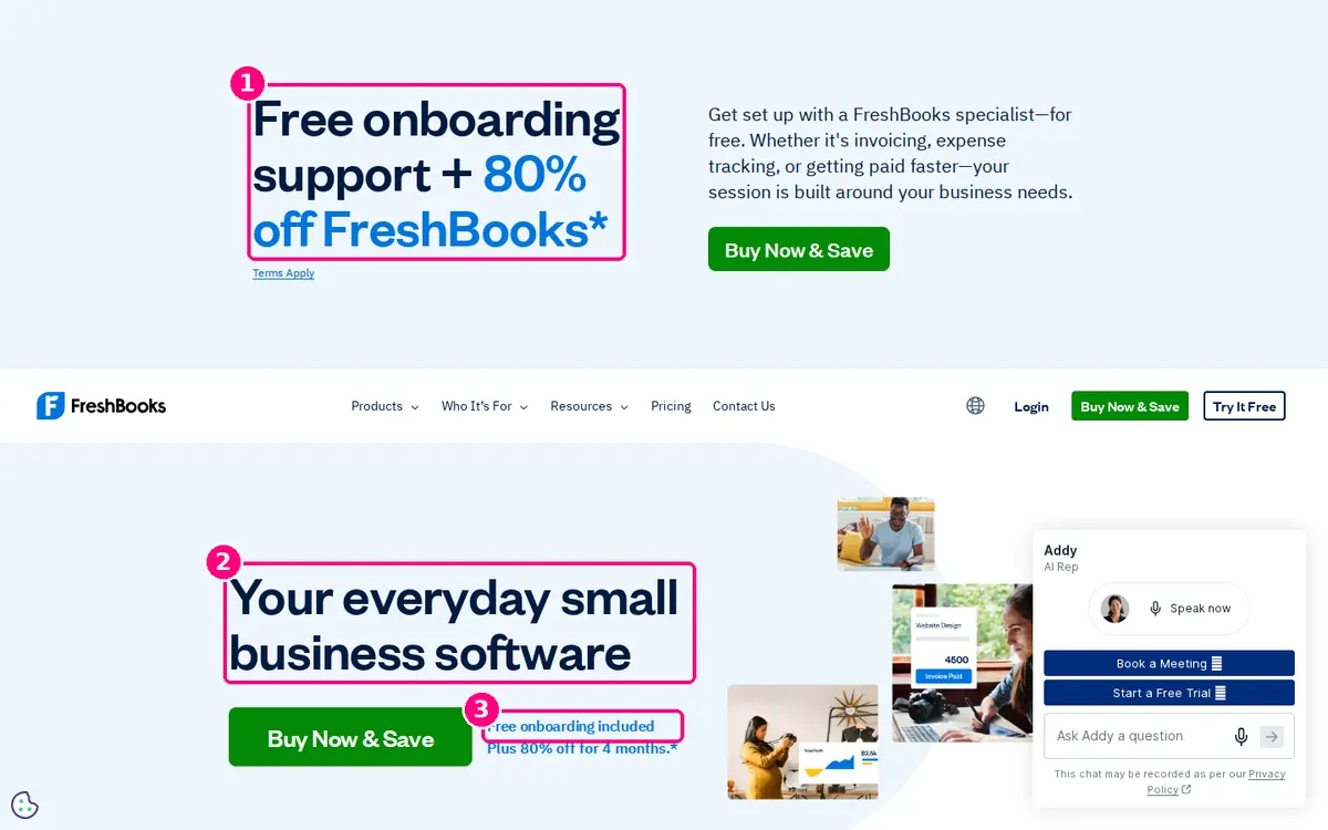
Screenshot: FreshBooks homepage, captured 2 November 2026.
- The offer leads the page. "Free onboarding support + 80% off FreshBooks" is the biggest text on the screen, above the logo.
- A plain category headline. "Your everyday small business software" tells a visitor what FreshBooks is in five words.
- The offer is repeated at the button. "Free onboarding included. Plus 80% off for 4 months." sits right beside "Buy Now & Save", with the duration of the discount stated.
Worth testing: the page pushes "Buy Now & Save" in the hero and "Try It Free" in the navigation. A visitor has to choose between two different first steps.
12. Squarespace: a big image, then "no credit card" under the button
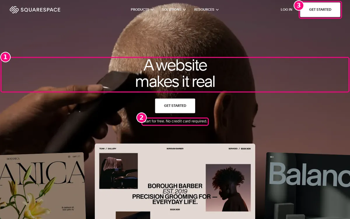
Screenshot: Squarespace homepage, captured 2 November 2026.
- An emotional headline. "A website makes it real" sells what a site means to a new business owner rather than listing builder features.
- The terms are directly under the button. "Start for free. No credit card required." is the only other text in the hero.
- The same action is repeated in the navigation. "Get started" appears in the header too, so it is one click away from the top of the page.
Copy this: if the hero is mostly image, keep the text to a headline, one button and one line of terms.
13. HubSpot CRM: "free forever" framed against a trial
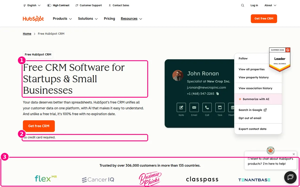
Screenshot: HubSpot, "Free CRM software", captured 2 November 2026.
- The headline names the audience and the price. "Free CRM Software for Startups & Small Businesses" includes the keyword, the buyer and the price.
- The body text contrasts free with a trial. "Unlike a free trial, it's 100% free with no expiration date", followed by "No credit card required." under the "Get free CRM" button.
- A specific count below the button. "Trusted by over 306,000 customers in more than 135 countries", with customer logos and a G2 Leader badge beside the product screenshot.
Copy this: if your free plan has no time limit, say so. "Free trial" and "free forever" carry different risks for the buyer.
14. Spotify Premium: the offer is the button
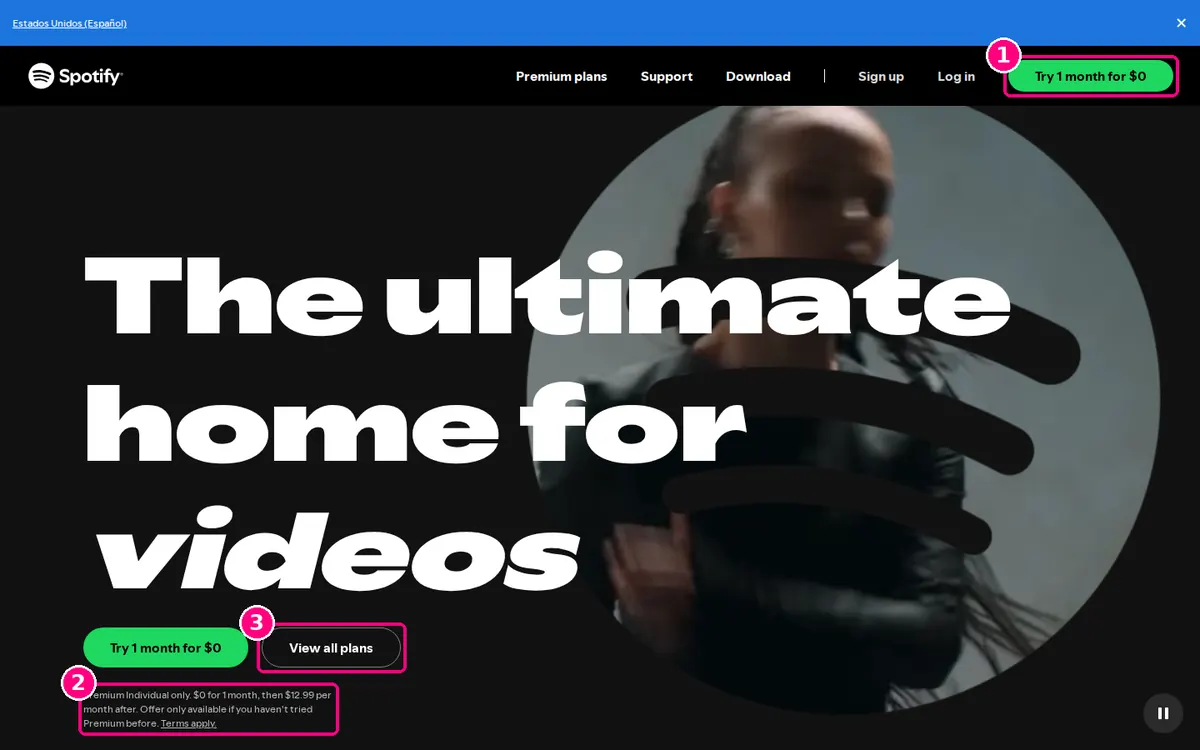
Screenshot: Spotify Premium, captured 2 November 2026.
- The offer is the button text. "Try 1 month for $0" appears in the navigation and the hero, so the deal is the call to action.
- The terms are on the page, not hidden. The small print under the buttons states the price after the trial ($12.99 per month), that it applies to Premium Individual only, and that it is for people who haven't tried Premium before.
- A second option for comparers. "View all plans" serves visitors who want to compare plans before they commit.
Copy this: state the price after the trial on the landing page itself. Visitors who only find it out later can feel misled.
Put proof next to the action
These pages use numbers that are hard to fake and place them where the visitor decides.
15. Ahrefs: a weekly sign-up count beside the buttons
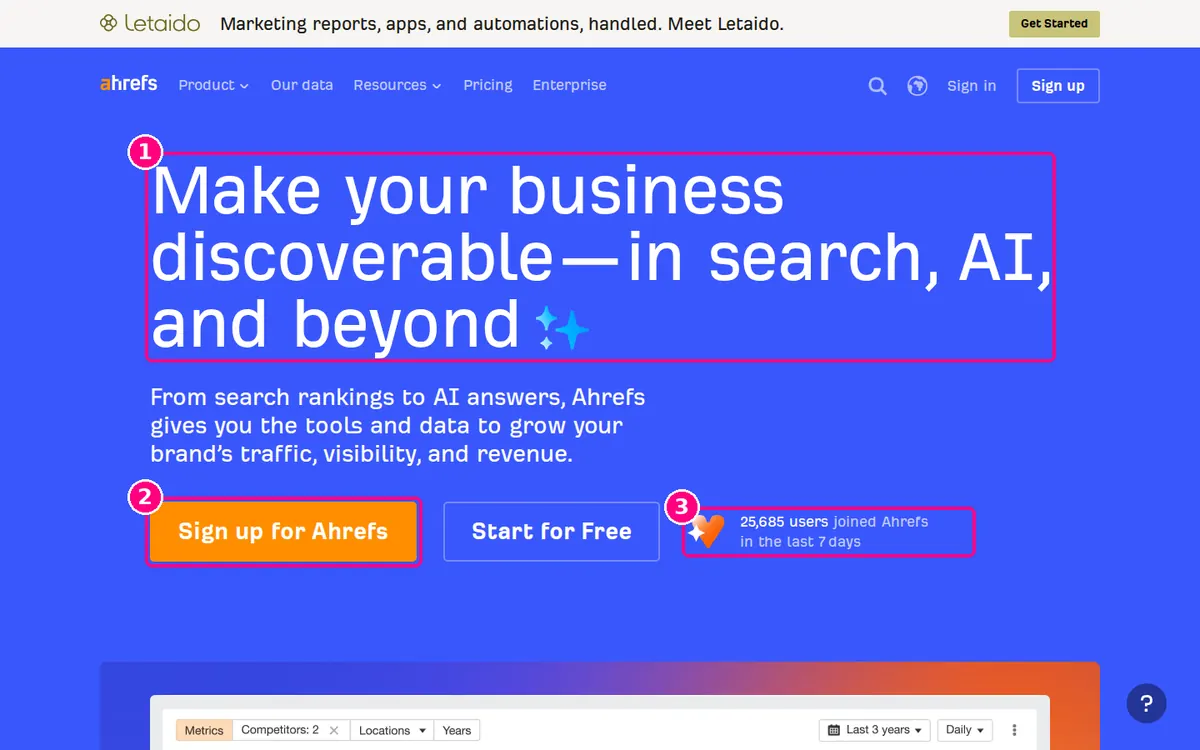
Screenshot: Ahrefs homepage, captured 2 November 2026.
- A broad promise. "Make your business discoverable—in search, AI, and beyond", with a subhead that spells out traffic, visibility and revenue.
- Two buttons, one goal. "Sign up for Ahrefs" and "Start for Free" both lead to sign-up; the free option catches visitors who aren't ready to pay.
- Recent, specific proof. "25,685 users joined Ahrefs in the last 7 days" sits beside the buttons. A weekly figure shows current momentum in a way an all-time total doesn't.
Copy this: if you have a recent, honest count (sign-ups this week, audits run today), put it next to your button.
16. Basecamp: a link list and a live user count
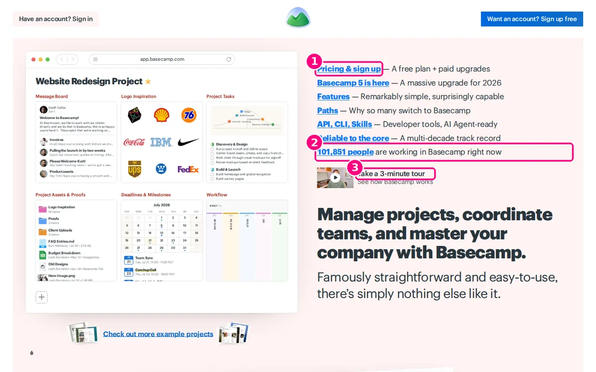
Screenshot: Basecamp homepage, captured 2 November 2026.
- Plain text links instead of a hero banner. "Pricing & sign up", "Features", "Paths" and others are listed with a one-line reason to click each, so visitors find their question quickly.
- A live count. "101,851 people are working in Basecamp right now" (the figure changes as you watch) is proof that the product is in use today.
- A short tour for hesitant visitors. "Take a 3-minute tour" states the time cost up front.
Copy this: when you offer a video or tour, say how long it is.
17. Stripe: a live statistic above the headline
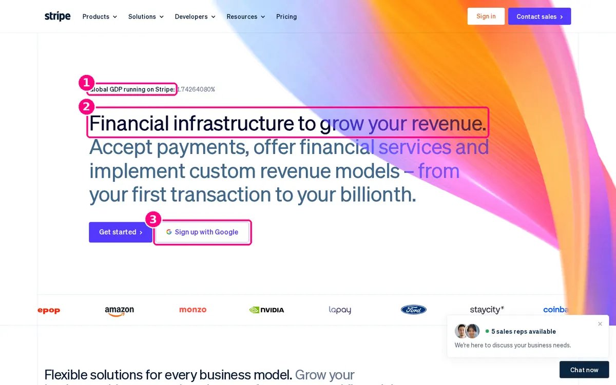
Screenshot: Stripe homepage, captured 2 November 2026 from the UK.
- A scale claim as a live counter. "Global GDP running on Stripe: 1.74264080%" ticks upwards above the headline. It is unusual, memorable and specific.
- The headline covers a wide range of buyers. "Financial infrastructure to grow your revenue" is followed by "from your first transaction to your billionth", which tells a start-up it is welcome as well as an enterprise.
- Google sign-up next to the main button. "Sign up with Google" sits beside "Get started", so a developer can create an account in one click.
Copy this: pick one number that only you can claim and show it above the fold.
18. Slack: two buttons for two kinds of visitor, logos underneath
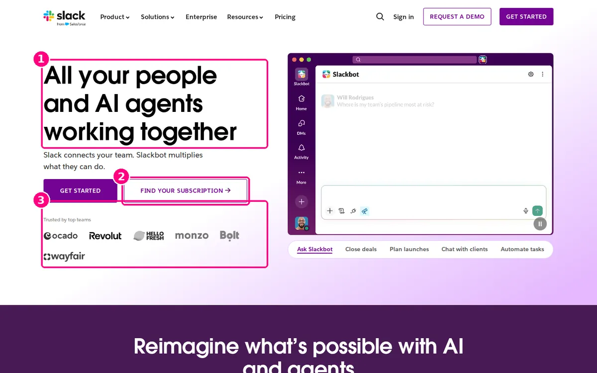
Screenshot: Slack homepage, captured 2 November 2026 from the UK.
- A short two-line pitch. "All your people and AI agents working together", with one sentence under it.
- A button for existing customers. "Find your subscription" sits beside "Get started", so visitors whose company already pays for Slack don't sign up twice or leave.
- Proof under the buttons. Under "Trusted by top teams" are names a UK visitor recognises (Ocado, Revolut, HelloFresh, Monzo, Bolt and Wayfair) on the UK version of the page.
Copy this: show logos your visitor's market recognises. Brands your visitors buy from themselves can carry more weight than famous names from another market.
Let visitors pick a path
These pages serve more than one audience and let the visitor say which one they are.
19. monday.com: role chips under the subhead
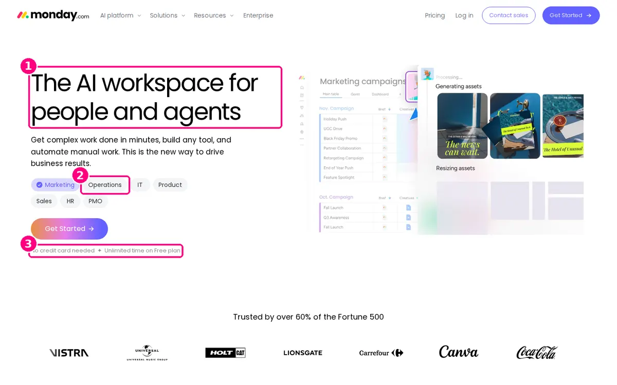
Screenshot: monday.com homepage, captured 2 November 2026.
- A headline for a broad product. "The AI workspace for people and agents" covers many use cases, so the page needs another way to make it personal.
- The visitor picks their team. Chips for Marketing, Operations, IT, Product, Sales, HR and PMO let the visitor say which team they're in, right under the subhead.
- Terms under the button. "No credit card needed. Unlimited time on Free plan." with "Trusted by over 60% of the Fortune 500" and logos below.
Copy this: if your product serves several roles, let visitors choose theirs above the fold instead of making one generic pitch.
20. Headspace: two products, two cards, two buttons
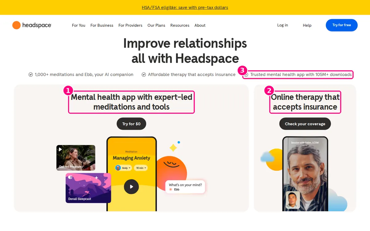
Screenshot: Headspace homepage, captured 2 November 2026.
- The app has its own card. "Mental health app with expert-led meditations and tools" with "Try for $0".
- Therapy has a different card and button. "Online therapy that accepts insurance" with "Check your coverage", a button that answers the first question a therapy buyer has.
- Proof sits above both. "Trusted mental health app with 105M+ downloads", next to "1,000+ meditations" and "Affordable therapy that accepts insurance".
Worth noting: the headline changed between our two visits ("Feel less anxious" and "Improve relationships"), which suggests it rotates or is being tested.
21. Duolingo: one button for new visitors, one for returning ones
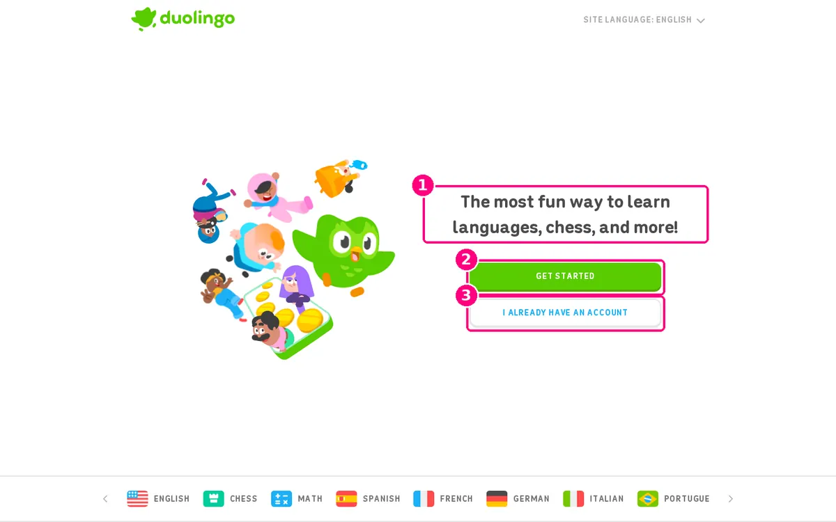
Screenshot: Duolingo homepage, captured 2 November 2026.
- A one-sentence pitch. "The most fun way to learn languages, chess, and more!" leads with the brand's difference: fun.
- One bright button. "Get started" is the only filled button on the page.
- A plain second button. "I already have an account" is styled as an outline, so it's easy to find without competing with the main action.
Copy this: if many visitors are returning users, give them a clearly secondary route instead of letting them fall into your sign-up flow.
Make starting easy
These pages cut the effort of the first step: one-click sign-up, or a smaller first commitment.
22. Calendly: Google and Microsoft sign-up as the main buttons
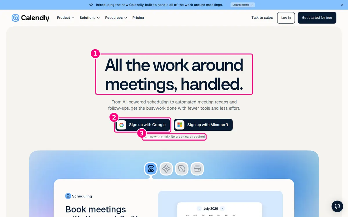
Screenshot: Calendly homepage, captured 2 November 2026.
- A headline about time saved. "All the work around meetings, handled." states the result in six words.
- Single sign-on is the main action. "Sign up with Google" and "Sign up with Microsoft" are the two buttons. Calendly works by connecting to a calendar, so signing up with the calendar account is a natural first step.
- Email and payment are handled in one small line. "Sign up with email • No credit card required" serves visitors who prefer not to connect an account.
Copy this: if your product needs a Google or Microsoft connection, offer it as the sign-up method.
23. Zapier: email or Google, side by side
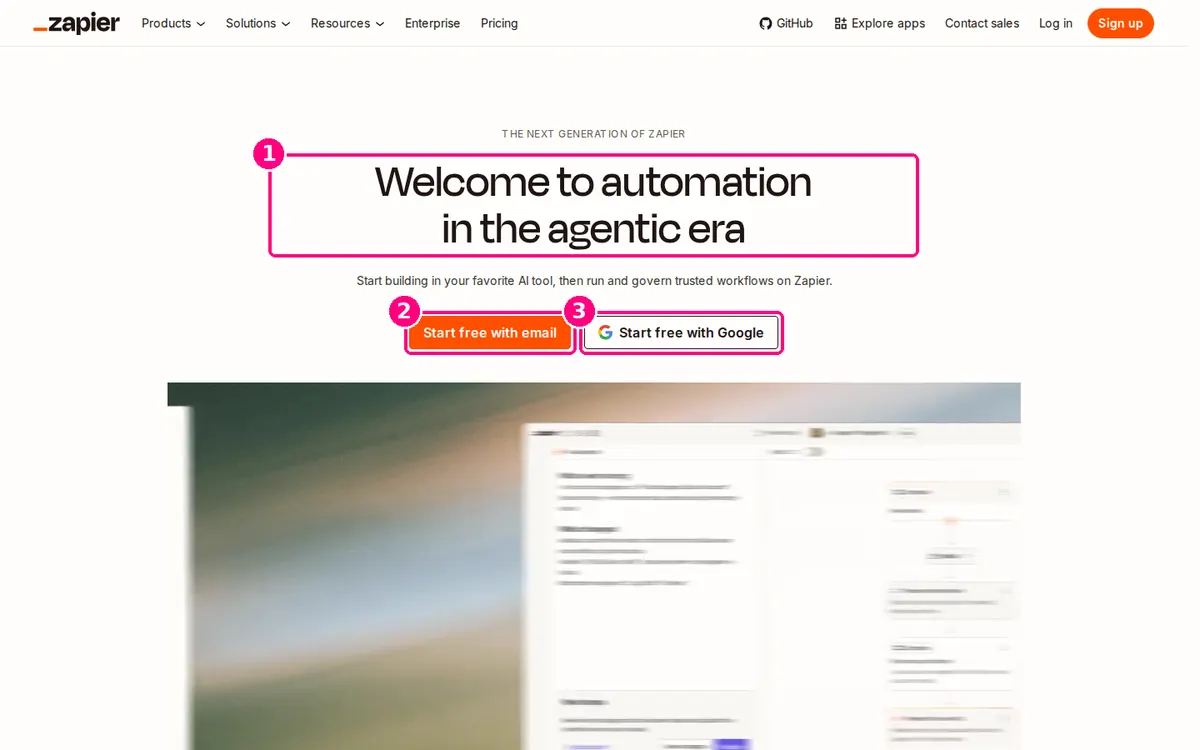
Screenshot: Zapier homepage, captured 2 November 2026.
- A headline aimed at current interest. "Welcome to automation in the agentic era" follows the AI agent trend.
- The primary button says "free". "Start free with email" puts the price in the button.
- Google sign-up gets equal space. "Start free with Google" sits beside it as an equal choice.
Worth testing: the headline is about the market, not the visitor. A version stating what visitors will automate could be tested against it.
24. Asana: team tabs and three ways to sign up
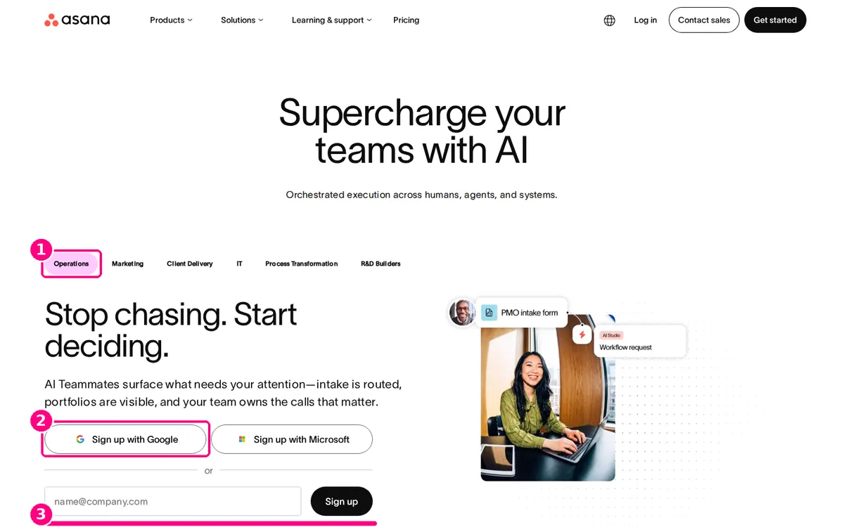
Screenshot: Asana homepage, captured 2 November 2026.
- Tabs by team. Operations, Marketing, Client Delivery, IT and others sit above the pitch, so visitors can find their own use case, like monday.com's chips.
- One-click options first. "Sign up with Google" and "Sign up with Microsoft" sit above the email field.
- Email as the fallback. A single work email field with a "Sign up" button, and the terms acknowledgement below it.
Worth noting: Asana showed us two different hero designs on repeat visits the same morning. One led with "Supercharge your teams with AI" and team tabs; the other with "The OS for human-agent teams" and a centred sign-up box. It's a reminder that the pages in any gallery, including this one, may be test variants.
25. Loom: a lighter second option
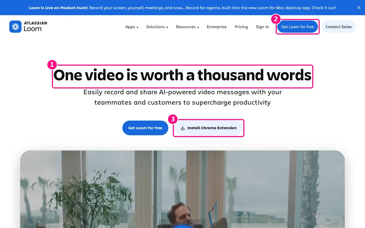
Screenshot: Loom homepage, captured 2 November 2026.
- A familiar phrase as the headline. "One video is worth a thousand words" is instantly understood, and the subhead names the real use: recording and sharing video messages with teammates and customers.
- "Free" is in the button text. "Get Loom for free" appears in the navigation and the hero.
- A smaller first step. "Install Chrome Extension" gives visitors who just want to record something now a faster route than creating an account first.
Copy this: offer a second action that's smaller, not a different goal. Loom's two buttons both lead to recording a video.
The 25 examples at a glance
| # | Page | Page type | Main technique | What to copy |
|---|---|---|---|---|
| 1 | Airbnb Host | Supply sign-up | Personal estimate | A calculator as the headline |
| 2 | Wise | Product page | Live quote | The price before the pitch |
| 3 | Semrush | Homepage | Domain input | A first field the visitor wants to fill |
| 4 | Netflix | Homepage | One field | Price and cancellation in one line |
| 5 | Shopify | Trial page | One field | The post-trial price |
| 6 | Trello | Homepage | Inline form | "Free" in the button |
| 7 | Intercom | Homepage | Work email | Trial terms under the button |
| 8 | Lyft Driver | Recruitment | Phone number | The field you'll follow up on |
| 9 | DoorDash Dasher | Recruitment | Form in hero | Optional fields marked optional |
| 10 | Kit | Homepage | Dated offer | Switching help under the button |
| 11 | FreshBooks | Homepage | Discount offer | The offer repeated at the button |
| 12 | Squarespace | Homepage | Image-led hero | One line of terms |
| 13 | HubSpot CRM | Product page | Free forever | Free plan vs trial, stated |
| 14 | Spotify Premium | Offer page | Offer as button | The price after the trial |
| 15 | Ahrefs | Homepage | Weekly sign-ups | Recent proof by the button |
| 16 | Basecamp | Homepage | Live user count | The length of the tour |
| 17 | Stripe | Homepage | Live statistic | One number only you can claim |
| 18 | Slack | Homepage | Two audiences | A route for existing customers |
| 19 | monday.com | Homepage | Role chips | Self-selection above the fold |
| 20 | Headspace | Homepage | Two product cards | A button that answers the first question |
| 21 | Duolingo | Homepage | New vs returning | A quiet second button |
| 22 | Calendly | Homepage | SSO first | Sign-up through the integration you need |
| 23 | Zapier | Homepage | Email or Google | Equal one-click option |
| 24 | Asana | Homepage | Team tabs | SSO above the email field |
| 25 | Loom | Homepage | Lighter second step | A smaller action, same goal |
Pages captured 2 November 2026. "Homepage" means the company's homepage; we include it because its first screen is built around a single sign-up action.
How long should a landing page be?
As long as the decision needs, with the essentials on the first screen. A free sign-up like Duolingo's needs one screen; a paid, considered purchase like HubSpot's CRM or Wise's transfers needs room for proof, pricing and answers further down. What matters most is that the first screen makes the visitor want to keep reading.
The research supports keeping the most important material at the top. In Nielsen Norman Group's 2018 eyetracking study, 57% of page-viewing time was spent above the fold and 74% in the first two screenfuls. Visitors do scroll, but NN/g's fold manifesto puts it plainly: "Users do scroll, but only if what's above the fold is promising enough."
| Offer | Typical length | Example from this list |
|---|---|---|
| Free sign-up or app download | One or two screens | Duolingo, Trello |
| Free trial of a paid tool | A hero plus feature, proof and pricing sections | Intercom, Kit |
| Paid purchase or high-trust service | A long page with detailed proof, pricing and objection handling | FreshBooks, Headspace therapy |
| Work or supply sign-up | A short form, then earnings and requirements below | Lyft, DoorDash, Airbnb Host |
Write the lower sections for scanners. NN/g's research on the F-shaped reading pattern found that people scan pages of unformatted text in an F-shape and miss content as a result. It recommends putting the most important points in the first two paragraphs, starting headings with the words that carry the most information, and using bullets.
What should be above the fold on a landing page?
The headline, one line of support, the main call to action, the terms that remove the biggest doubt, and one piece of specific proof. The strongest examples above fit most of these into the first screen of a 1440 × 900 desktop window. Things that can wait include the feature list, the full pricing table and the FAQ.
| Element | Job | Strong example |
|---|---|---|
| Headline | State the visitor's outcome | Airbnb: "Your home could make £811 on Airbnb" |
| Supporting line | Say who it's for or how it works | Kit: "The email platform for creator business owners" |
| Call to action | One action, named for its result | Semrush: "Get insights" |
| Terms | Remove the biggest doubt | Netflix: "Starts at £7.99. Cancel at any time." |
| Proof | A specific number or recognisable names | Wise: 4.8 stars from 1.3M Google Play reviews |
If your form has more than one or two fields, NN/g's web form design guidance recommends removing any field you can collect later or work out another way. NN/g reports cutting one of its own forms from six fields to two this way. Our guide to landing page headlines that convert covers how to write the first element in that table.
How to use these examples on your own page
Don't copy a layout. Find the gap on your own page, then borrow the technique that closes it.
- Read your first screen as a stranger. Can you tell what you'd get, what it costs and what to click, in five seconds?
- Find the missing trait. Check your page against the five traits at the top of this article. Most pages miss one or two, usually the terms beside the button or specific proof.
- Pick the matching example. Missing terms? Look at Netflix, Kit and Spotify. Weak proof? Look at Ahrefs, Wise and HubSpot. Too many fields? Look at Trello, Calendly and Lyft.
- Change one thing and measure it. If you have the traffic for an A/B test, test it. If you don't, make the change and compare conversion over the same weeks before and after. Our landing page optimization best practices explain both approaches.
If you'd rather have someone else spot the gaps, a landing page audit checks the same elements: headline clarity, call to action, proof, form friction and the first screen on mobile.
How we chose these examples
We looked for pages where the first screen is clearly built to get one action, from companies that sell in volume through those pages, across SaaS, consumer subscriptions, marketplaces and recruitment. We captured each page on 2 November 2026 in a 1440 × 900 desktop browser from the UK, so some show UK prices or redirected to a UK version. We hid cookie banners and most pop-ups so the page itself is visible, and changed nothing else. Some chat buttons are still visible. The callouts and notes are our own analysis.
We can't see these pages' conversion rates. None of the companies publish them, so "high-converting" here means "built around the traits that usability research and conversion practice support", not a measured result. Pages change often, and at least two of them (Asana and Headspace) showed different versions on repeat visits, so what you see today may differ. We have no commercial relationship with any of the 25 companies. For more examples, Unbounce keeps a gallery of landing page examples, mostly pages built on its own platform.
Screenshots are shown for commentary and review. The page designs, logos and photography belong to their owners.
Check your own landing page
Seen a technique you're missing? Run a Croopt audit on your page to see which of these traits your page already has and which conversion issues to fix first.
Sources and author
- The 25 landing pages linked in each caption and in the summary table, captured 2 November 2026. Every quoted headline, button, price and figure is taken from those captures; live counters (Basecamp, Stripe, Ahrefs) show the value at the time of capture.
- Nielsen Norman Group, Scrolling and Attention (April 2018), retrieved 2 November 2026. Used for the 57% and 74% viewing-time figures.
- Nielsen Norman Group, The Fold Manifesto: Why the Page Fold Still Matters, retrieved 2 November 2026.
- Nielsen Norman Group, F-Shaped Pattern of Reading on the Web, retrieved 2 November 2026.
- Nielsen Norman Group, Website Forms Usability: Top 10 Recommendations, retrieved 2 November 2026. Used for the field-reduction advice and the six-to-two example.
- Unbounce, Landing page examples, retrieved 2 November 2026.
Kieron Bertani is the founder of Croopt, the landing page audit tool mentioned in this article, and writes about conversion rate optimisation. This article and its hero illustration were created with AI assistance; the screenshots were captured and annotated for this article. The analysis is editorial and based on the published pages, not on access to the companies' data. For corrections or product questions, contact Croopt support.
External resources